Home ImprovementCARIBBEANPenta Paint
Penta faced a classic challenge in the paint category: achieving the right balance between emotional appeal and practical clarity. The brand needed to connect with modern home decorators and still work for professional users. Too playful, and it risked losing credibility. Too technical, and it could alienate a growing group of independent design-savvy customers, especially women who are increasingly leading their own home improvement projects.
Despite its strong heritage, Penta didn't stand out. The rainbow icon was generic, and the packaging failed to guide or connect with customers.
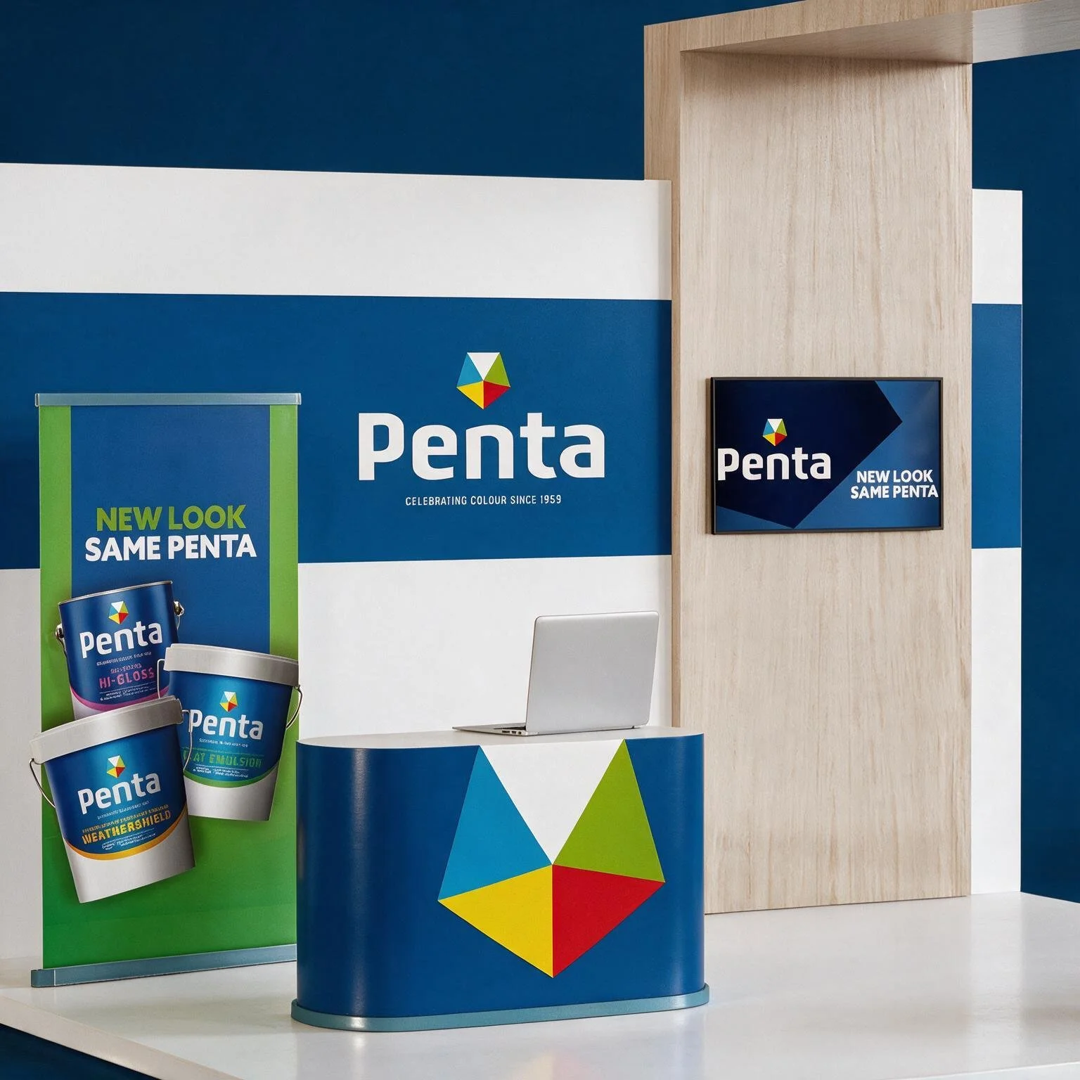
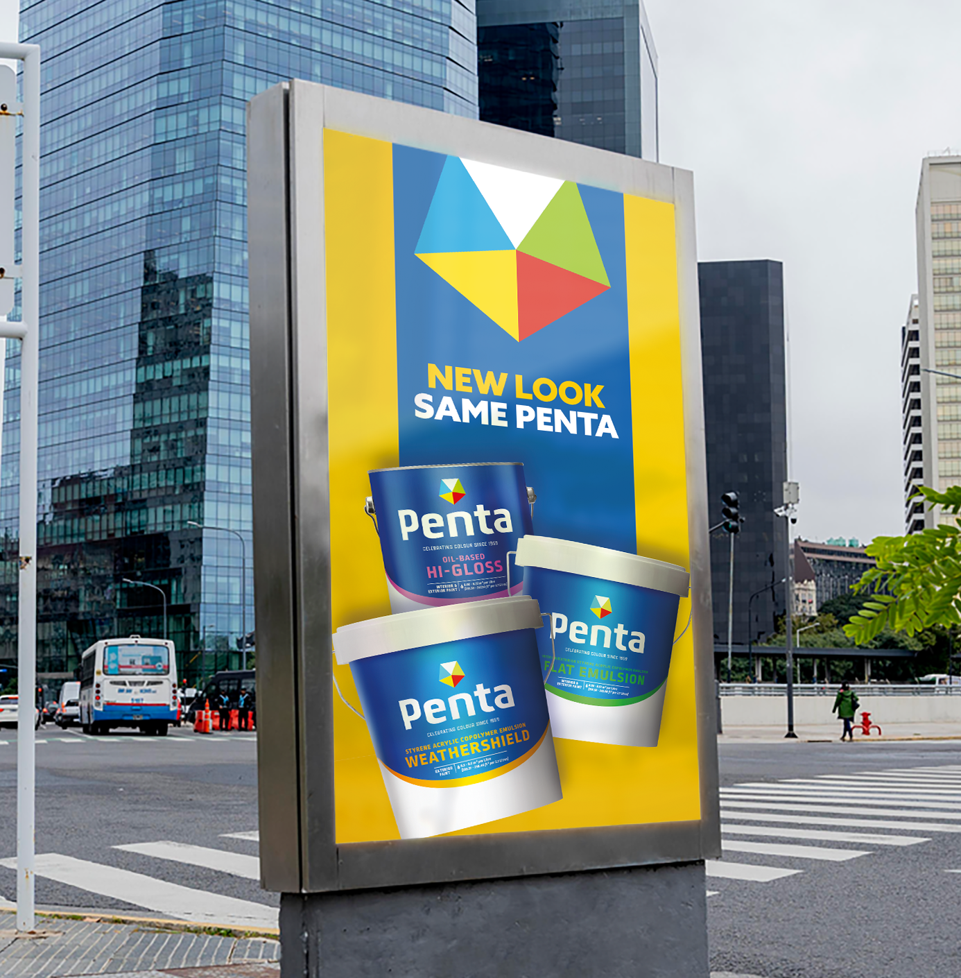
We repositioned the brand to stand out and created assets to communicate value through design, rather than relying on discounts, as it had until then. Penta now brings clarity, confidence, and colour back to the mainstream shelf. With a bold new identity and a simplified system, the brand is set to grow and stand out for years to come.
Identity
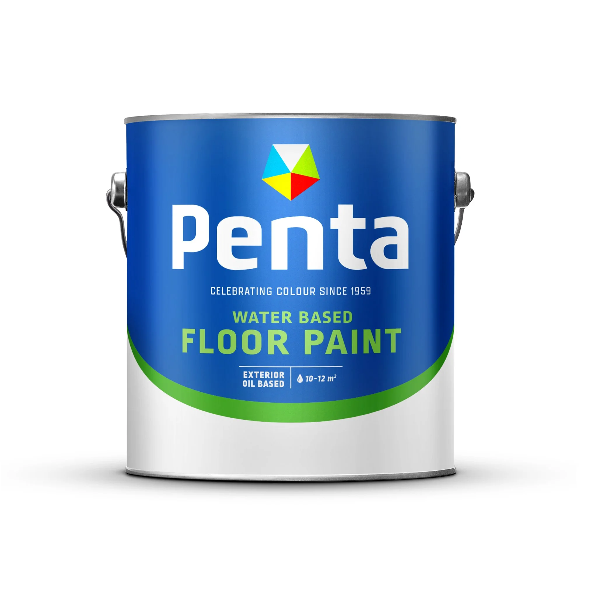
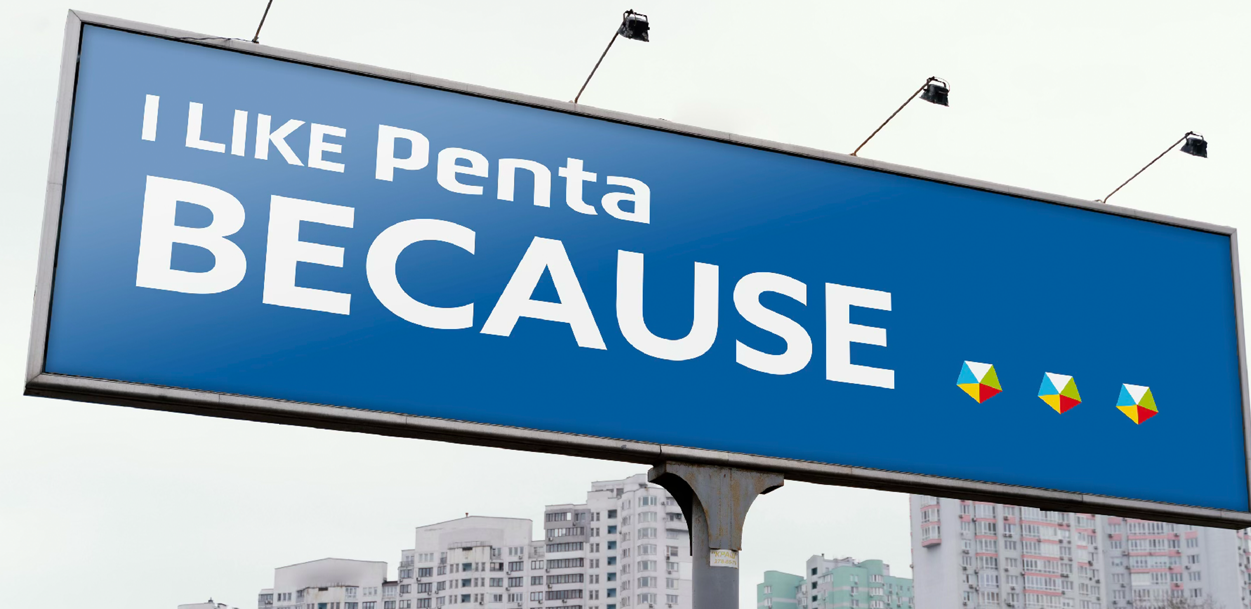
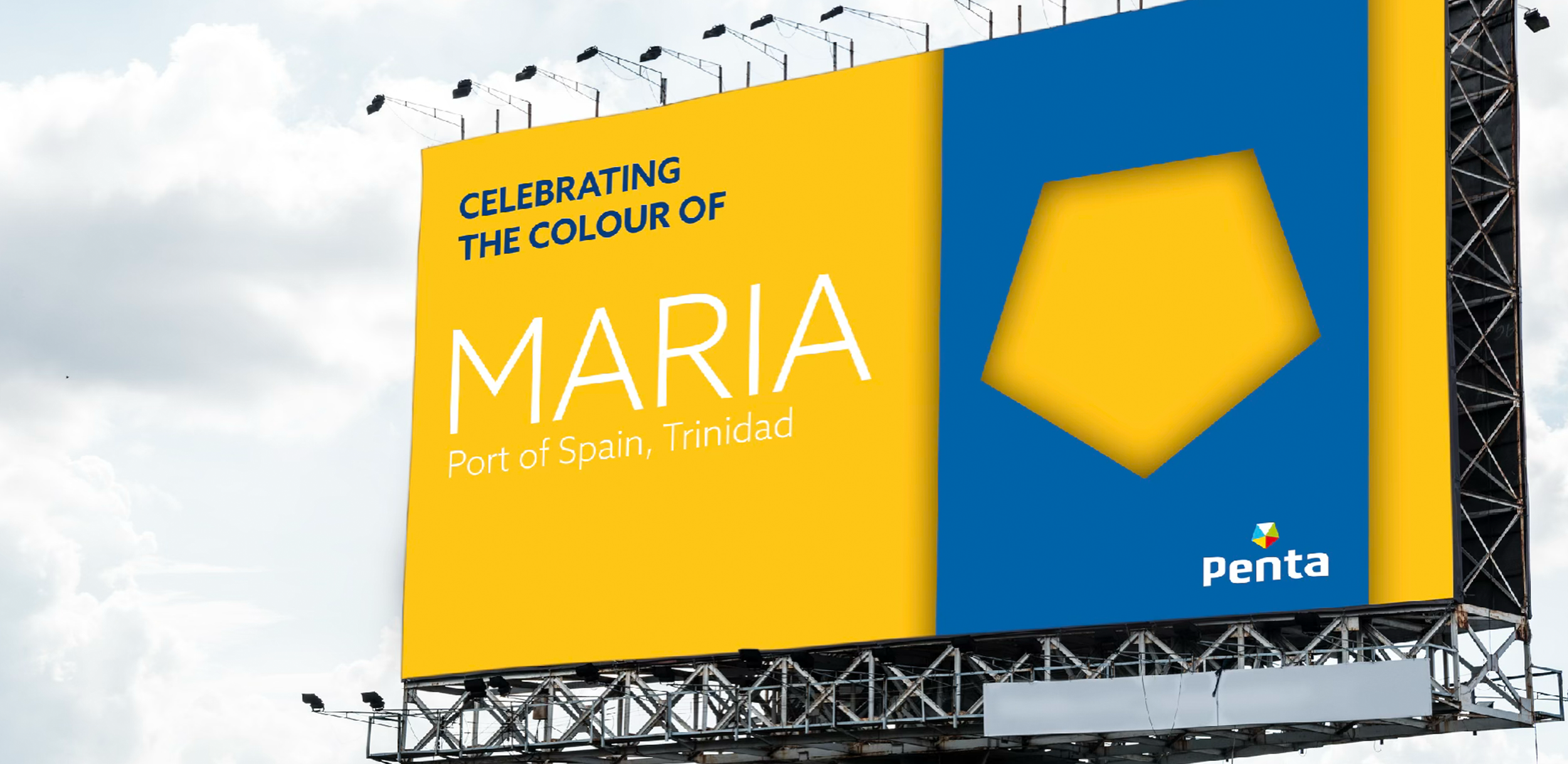
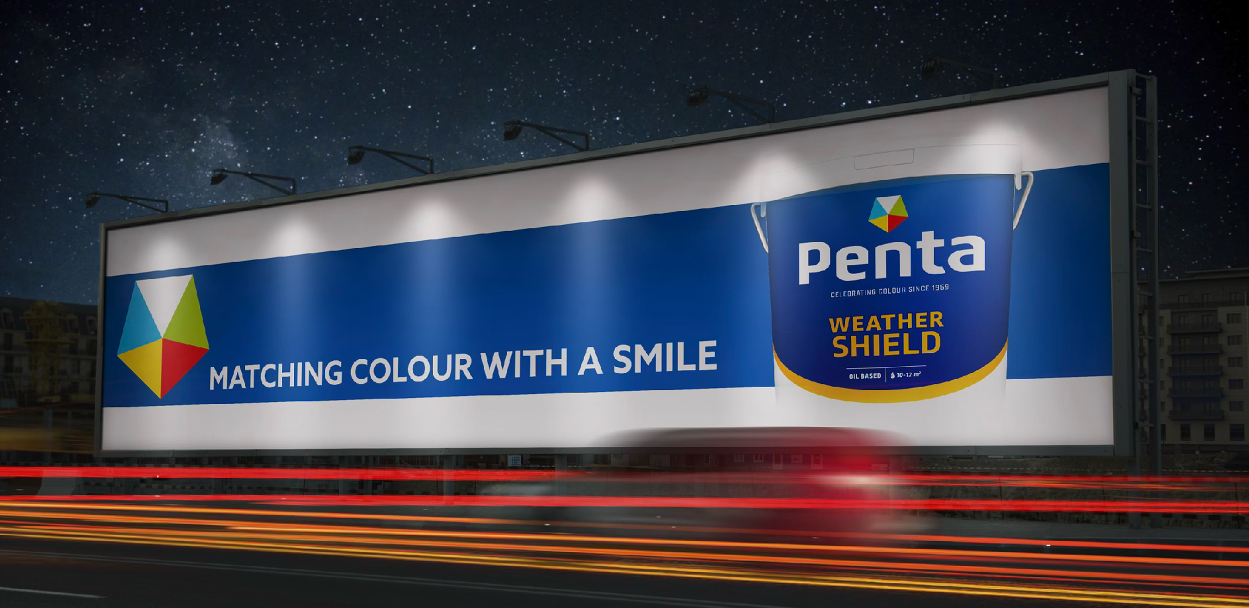
We replaced the original rainbow with a distinctive pentagon mark that reflects five colour segments and ties directly to the name. The new wordmark modernised the original while keeping it recognisable.
Product Architecture
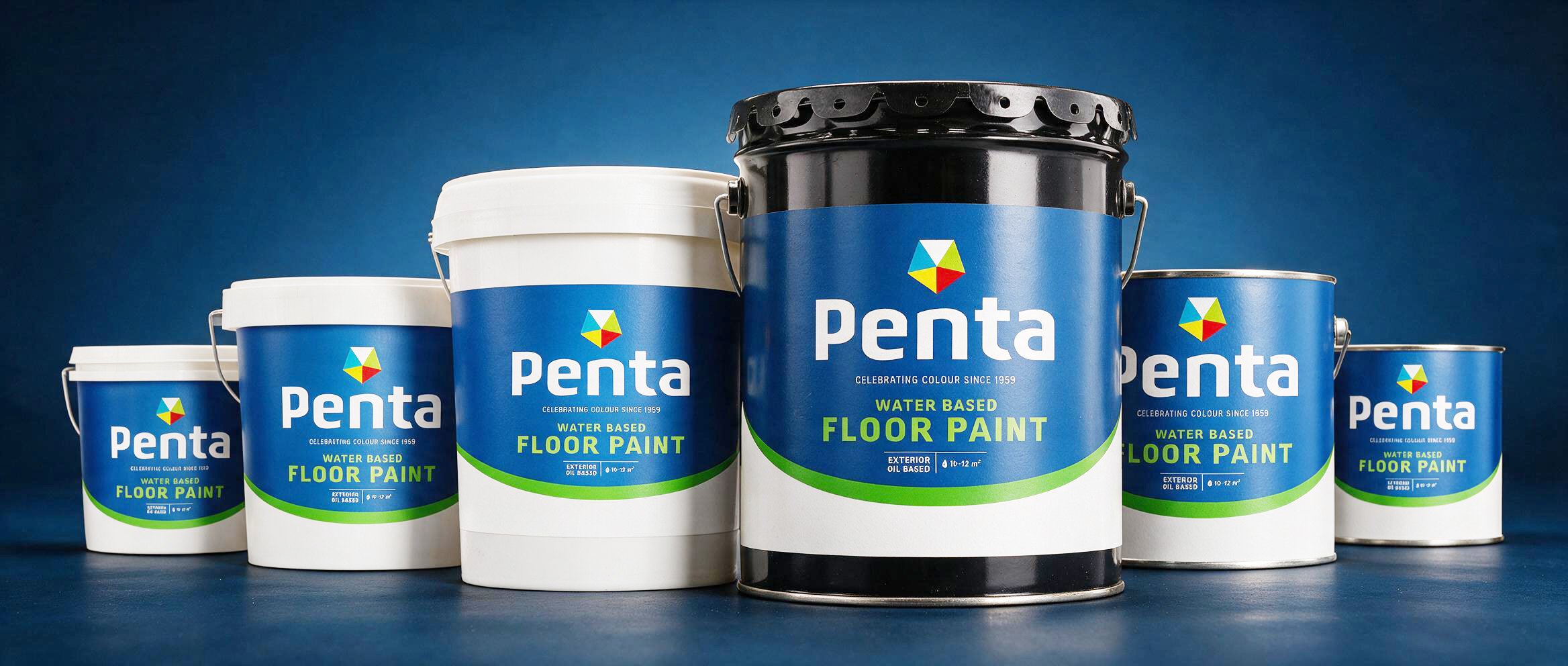
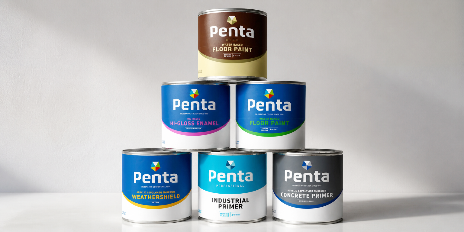
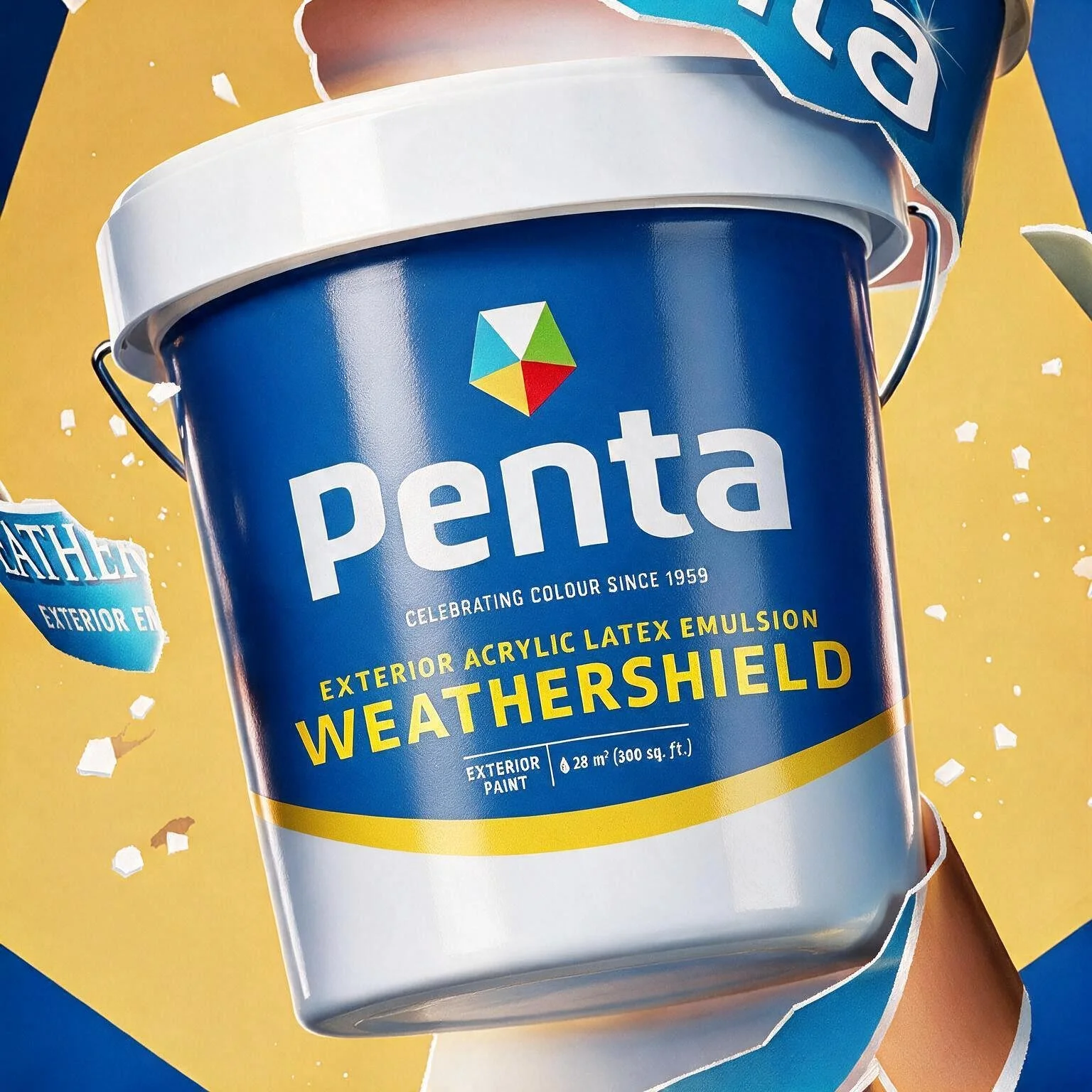
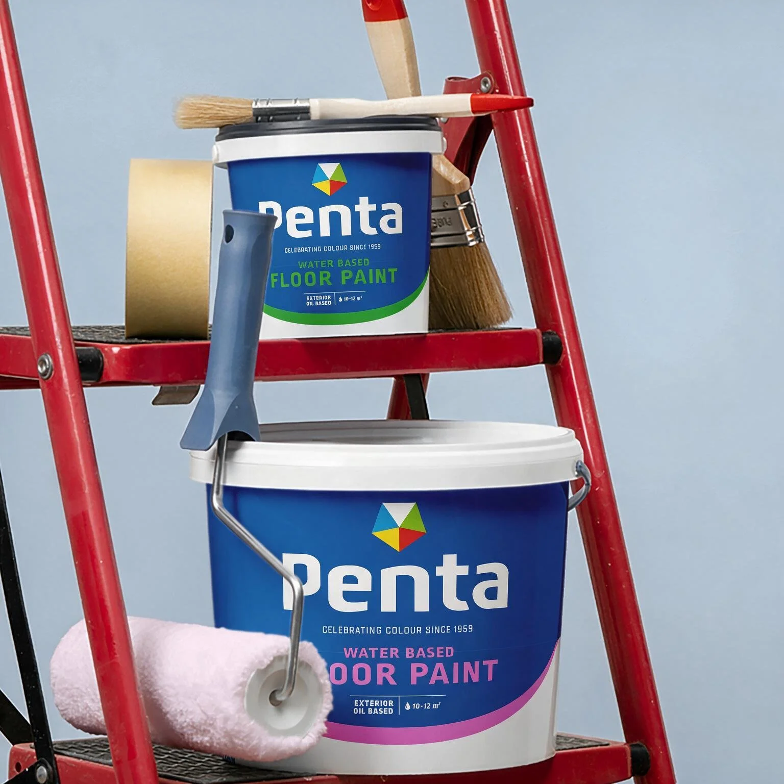
We created a clean, bold design system that makes it easy to find the right product. The colour of the ‘smile’ indicates the product type and use. It also adds a human, uplifting touch. The packaging doesn’t show the paint colour because it's always mixed on-demand at the store.