CARIBBEANFMCGFruta Juice
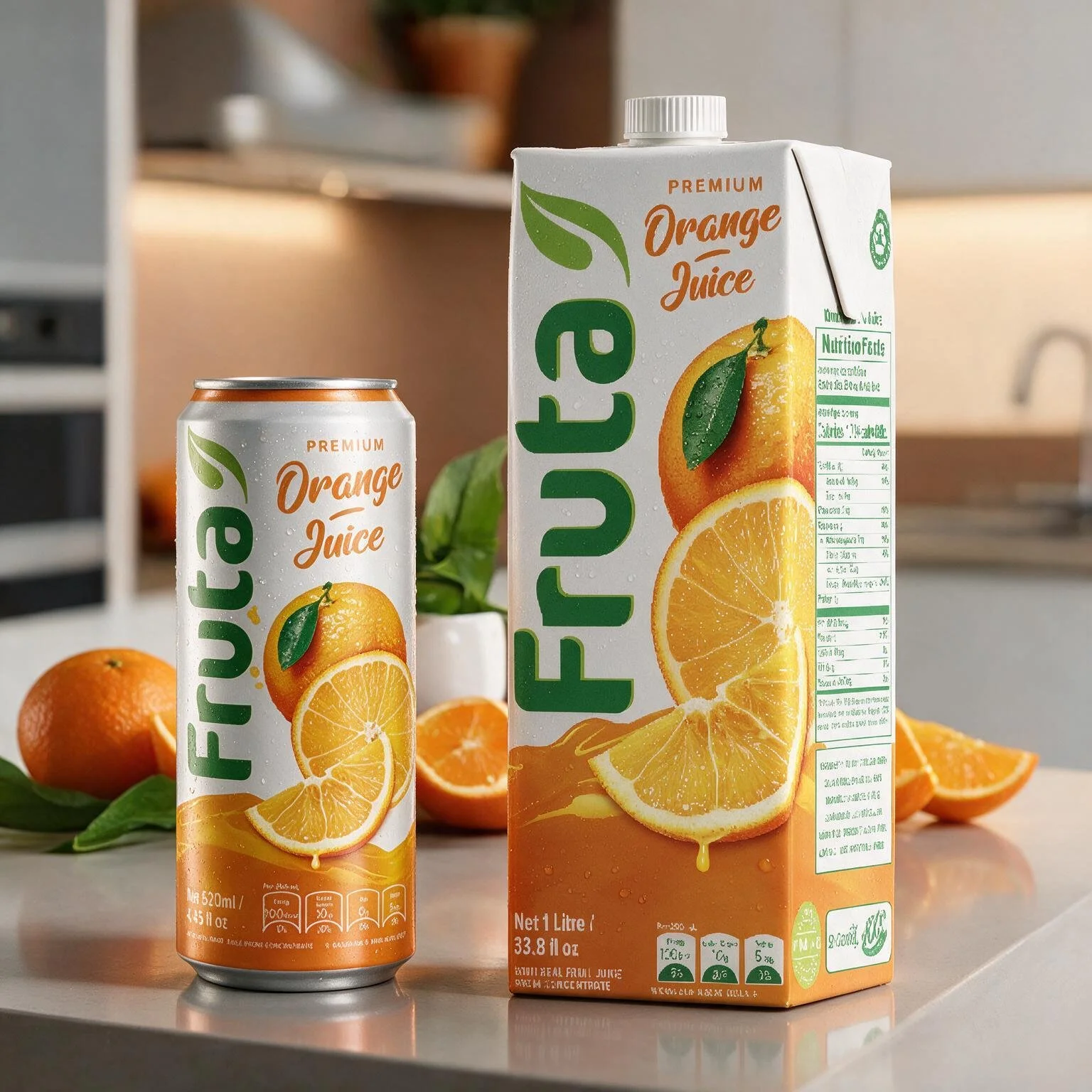
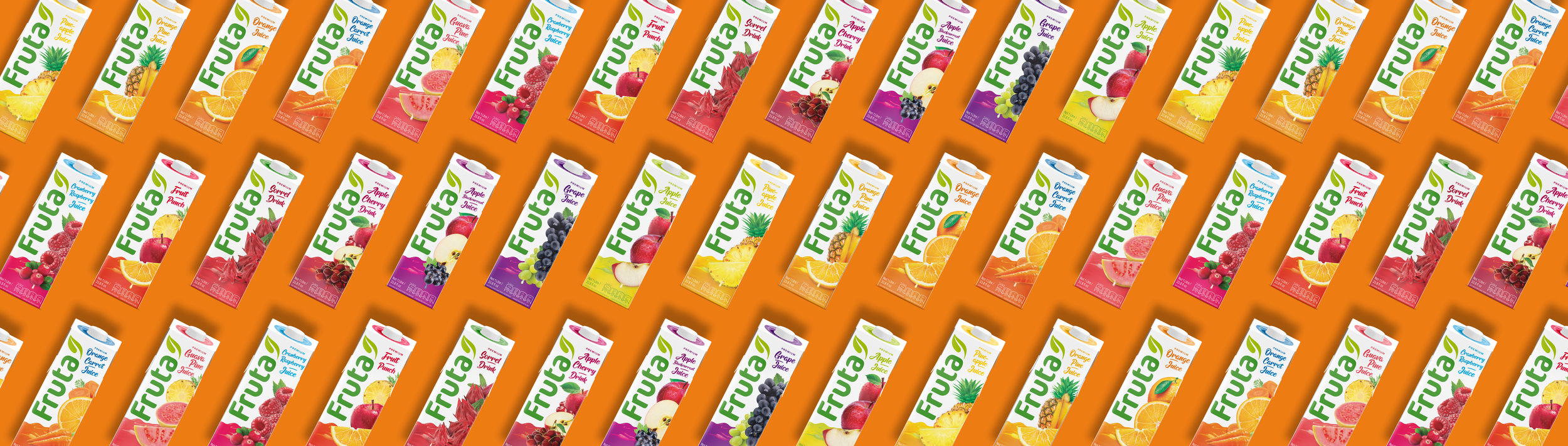
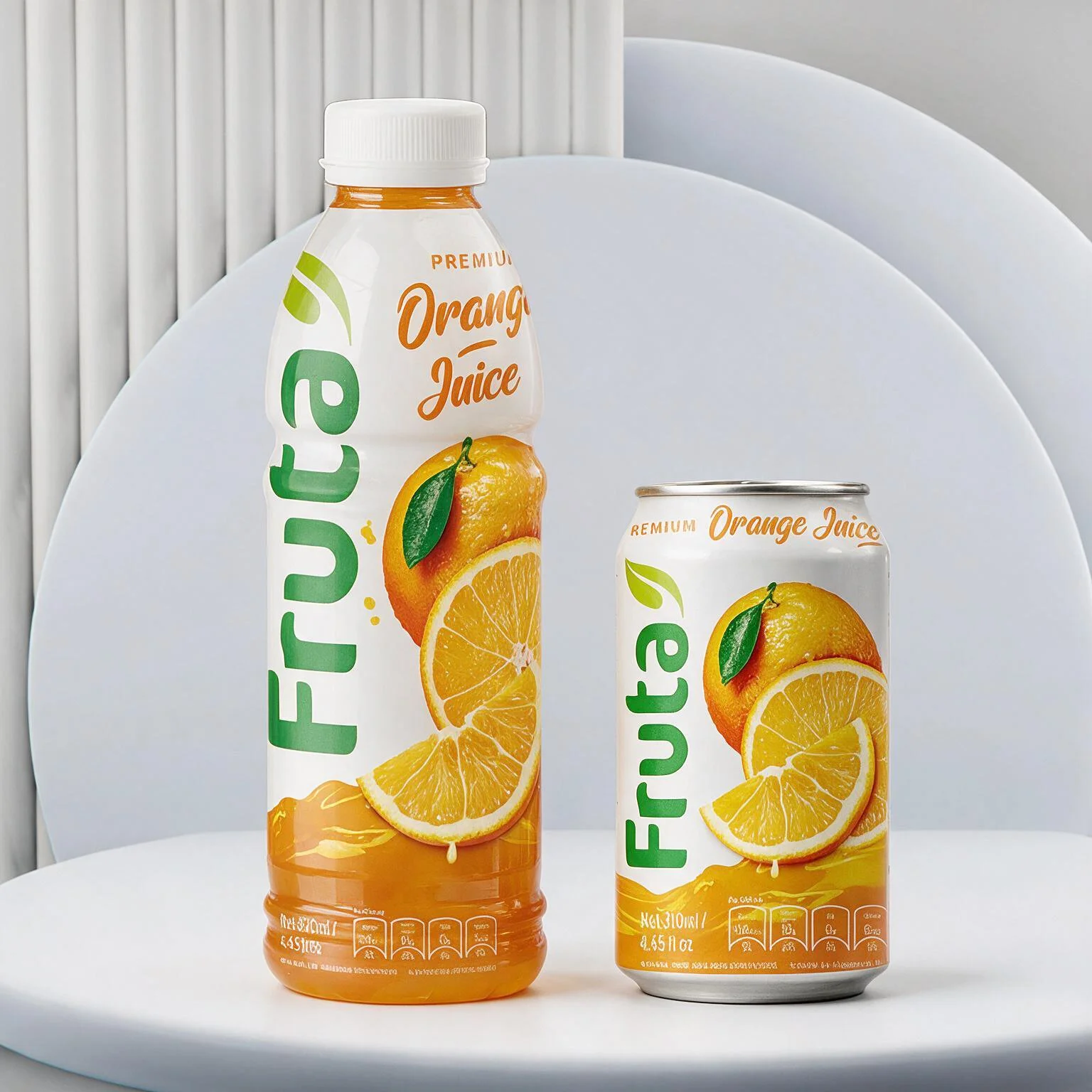
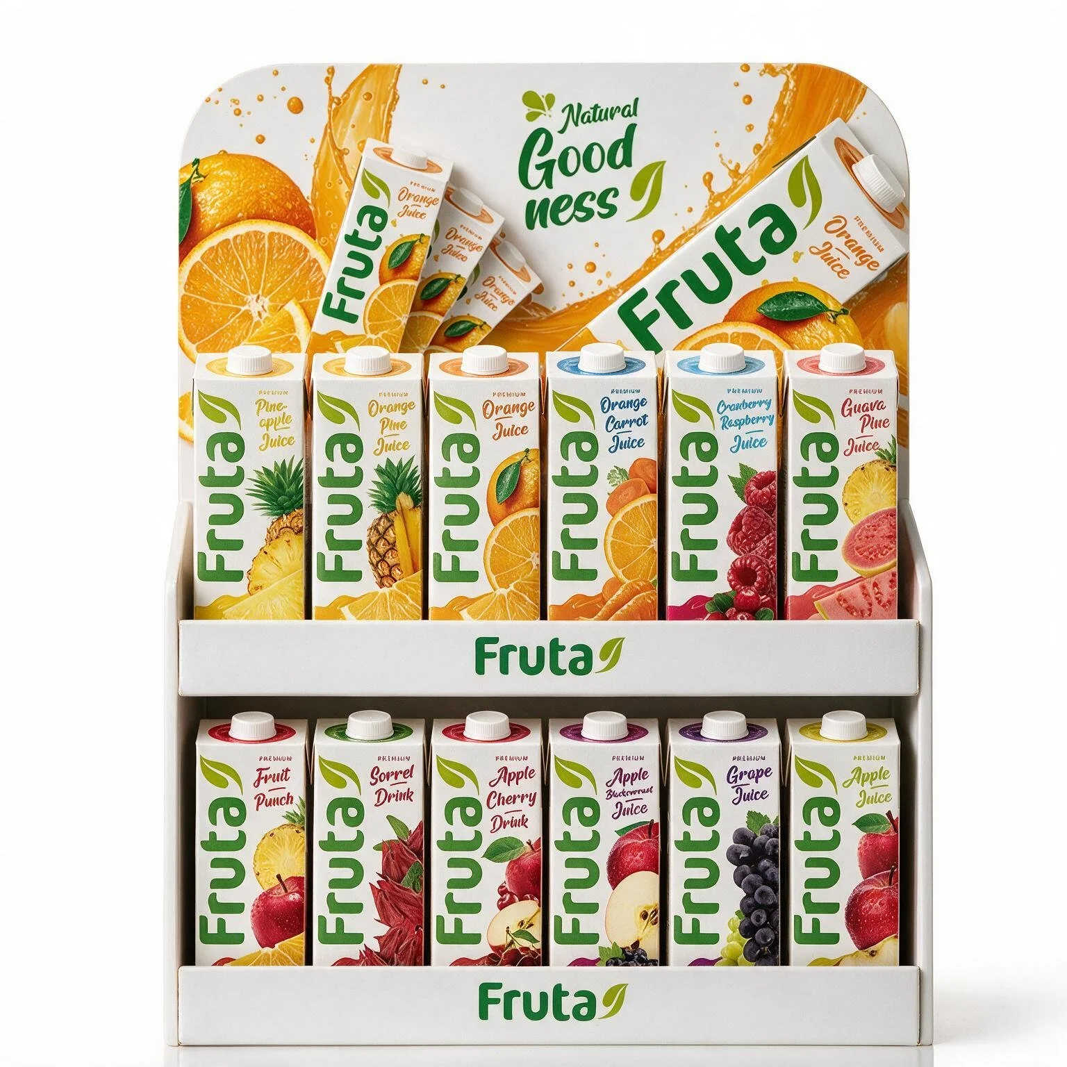
Fruta is a household name across the Caribbean, but the brand had lost its freshness and taste appeal. With over ten juice drinks in different sizes and pack types, we set out to make the whole range feel juicy and vibrant again.
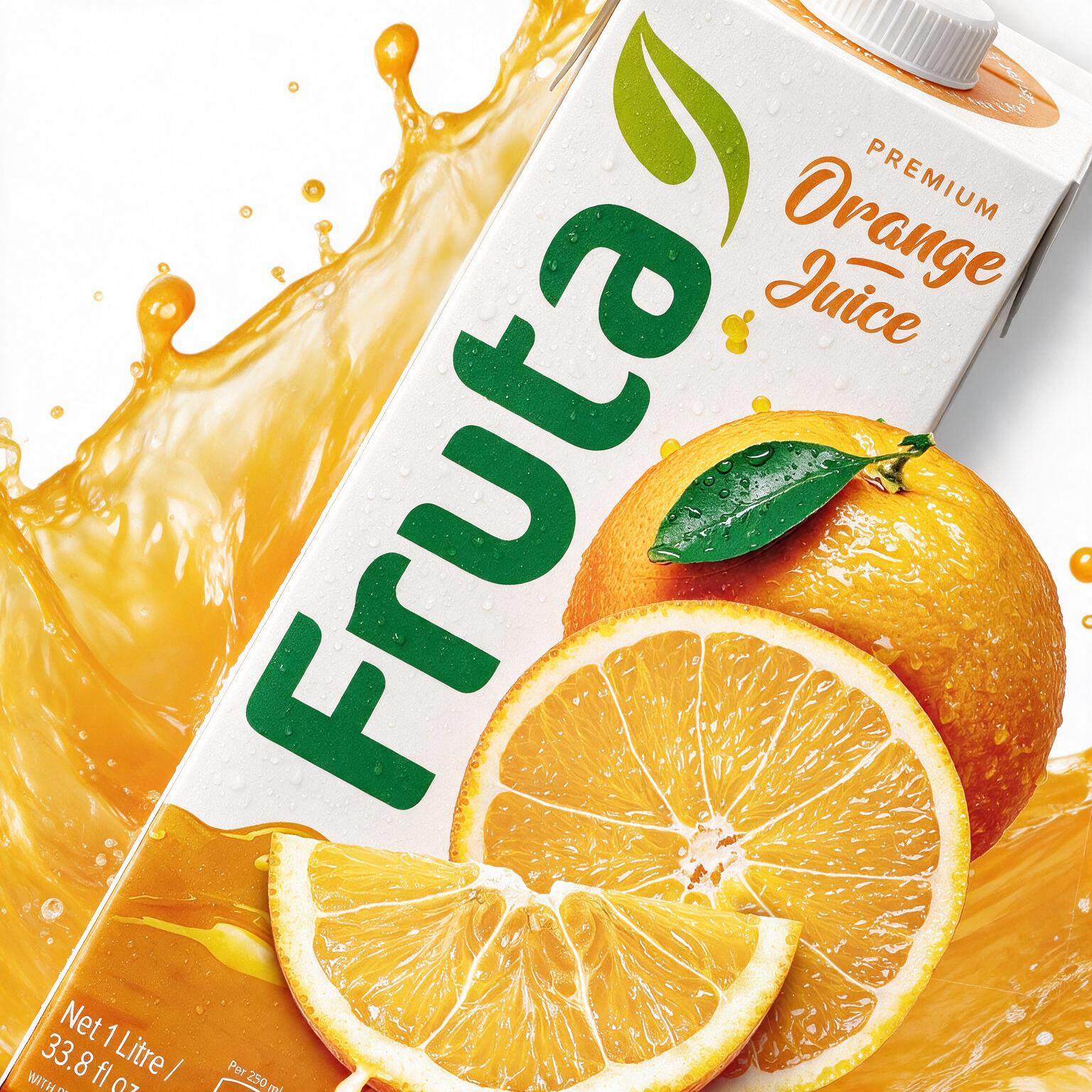
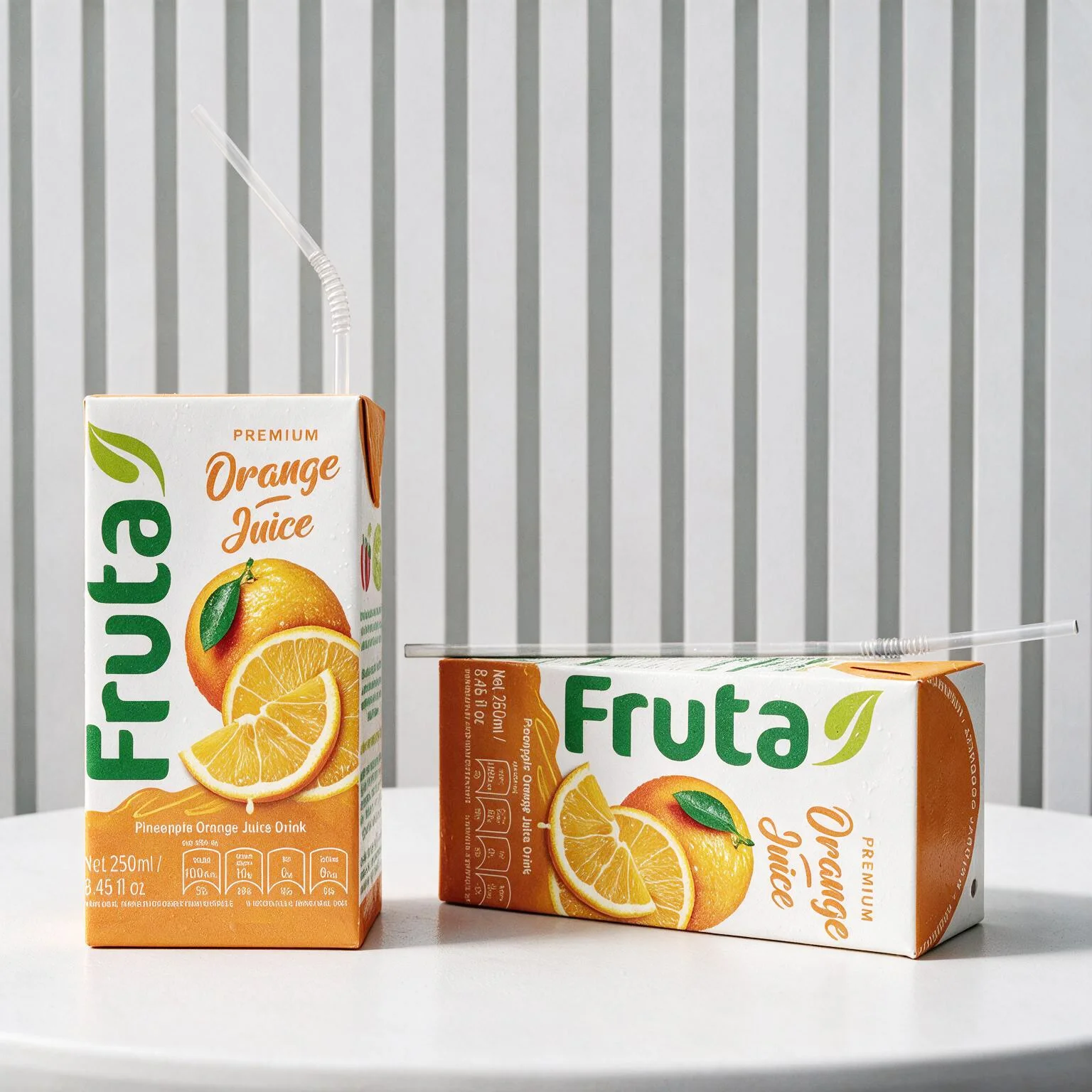
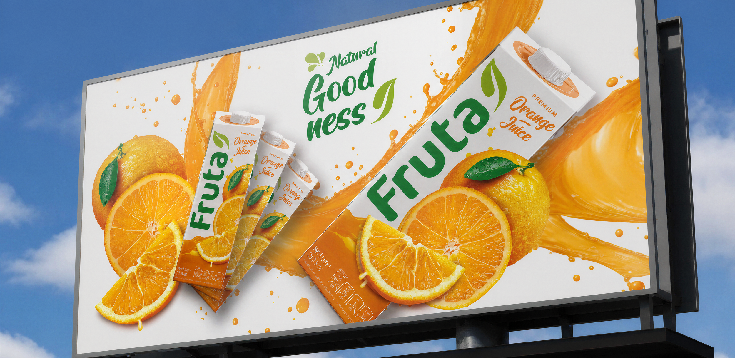
We chose white as the main colour to help the packs stand out. On this clean background, the fruits take centre stage, with a refreshed vertical logo as a mark of quality.
3D fruit photography & Navigation
The fruit photography wraps around the pack, turning flat images into lifelike, 3D fruit. We added colour cues at the top of the Tetra packs, so even if the pack is in a low fridge or turned around, people always know which flavour to pick.
Launch success
The rebrand was such a huge success that Fruta was challenged to keep up with demand. It outperformed its main competitor, who tried to rebrand but couldn’t catch up. Fruta has kept growing ever since.