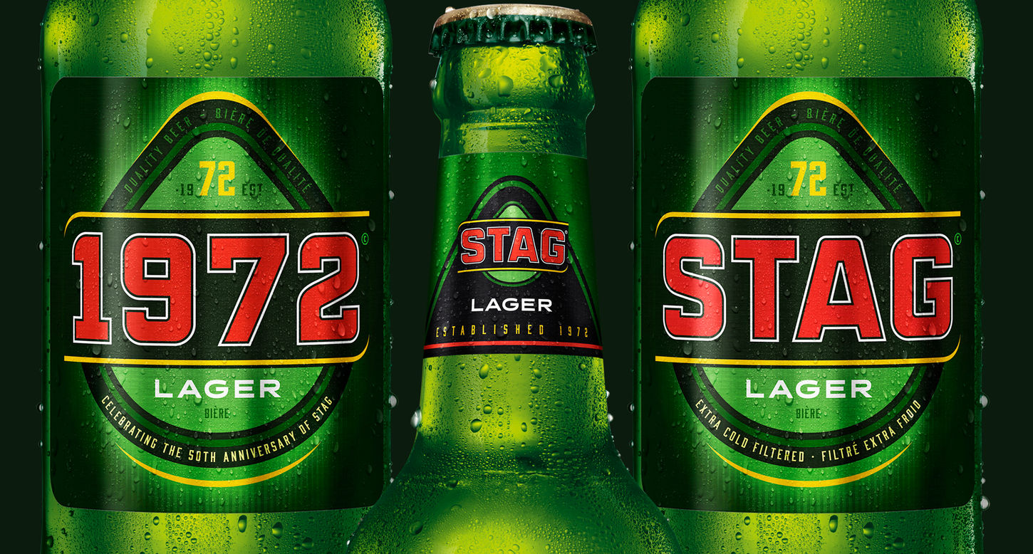
STAG Lager Beer
For contemporary men
There used to be a unique code that distinguished male beer drinkers from the rest of us. It felt much like; This is our space; please leave us in peace. It was not inclusive; the brands associated with this mentality were seen as their badge separating 'the men from the rest'. Times have changed. It's OK to be a male beer drinker with a specific brand preference, but inclusivity has become the norm.
Stag lager was a brand that had been associated with being one of the guys for years. Over time the brand attracted many women and guys who flipped between brands. They did this because of the taste, not because of the brand's evolved character. Stag drinkers will convince you that their brand has more of a bite, while Carib, the alternative, has a more accessible and balanced taste.
Our design challenge was simply to give the brand a more contemporary feel. Dust off the stubborn old look, making the trusted old brand look more from now. But to do this without alienating its very conservative base. A delicate balancing act.
We have re-crafted the total label. Everything has been redrawn and re-proportioned, giving the final result a sharper overall appearance. The new look feels fitter and more contemporary.


