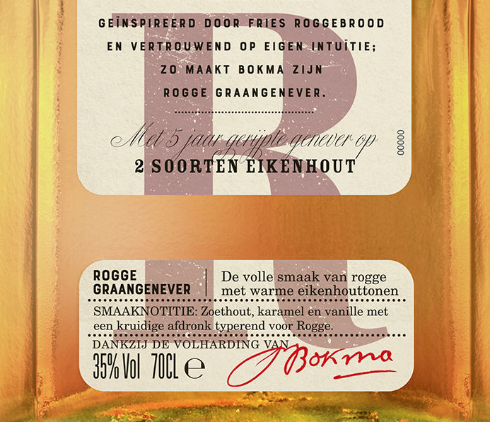
BOKMA Jenever
An Original Dutch Jenever
This well-known timeless classic of the Netherlands had become dusty and, in the process, had lost Its elegance and feeling of prestige. It desperately needed respect and careful craftsmanship to be restored and re-elevated to its once prestigious position in its market.
We advised the client to solve their challenge by attacking the problem on two fronts.
One, as the brand is composed of a collection of very different spirits, attracting very different tastes, we advised making BOKMA an umbrella brand under which these products could be collectively housed. Each product needed its own label design language, but with enough linkage to one another to ensure brand cohesion.
Two, the brand promise should be strengthened by noticeable differences in product composition, barrel type and ageing. We also advised that bottle size should play a role in the final line-up. The two more standard products are showcased in 1 LT bottle, while the more specialised products will be in smaller, more refined 70 CL bottles.
We spent most of our time crafting the specific design language for each product, ensuring enough attention to storytelling and mystique for each.


