ANSA Bank
Unthink Banking
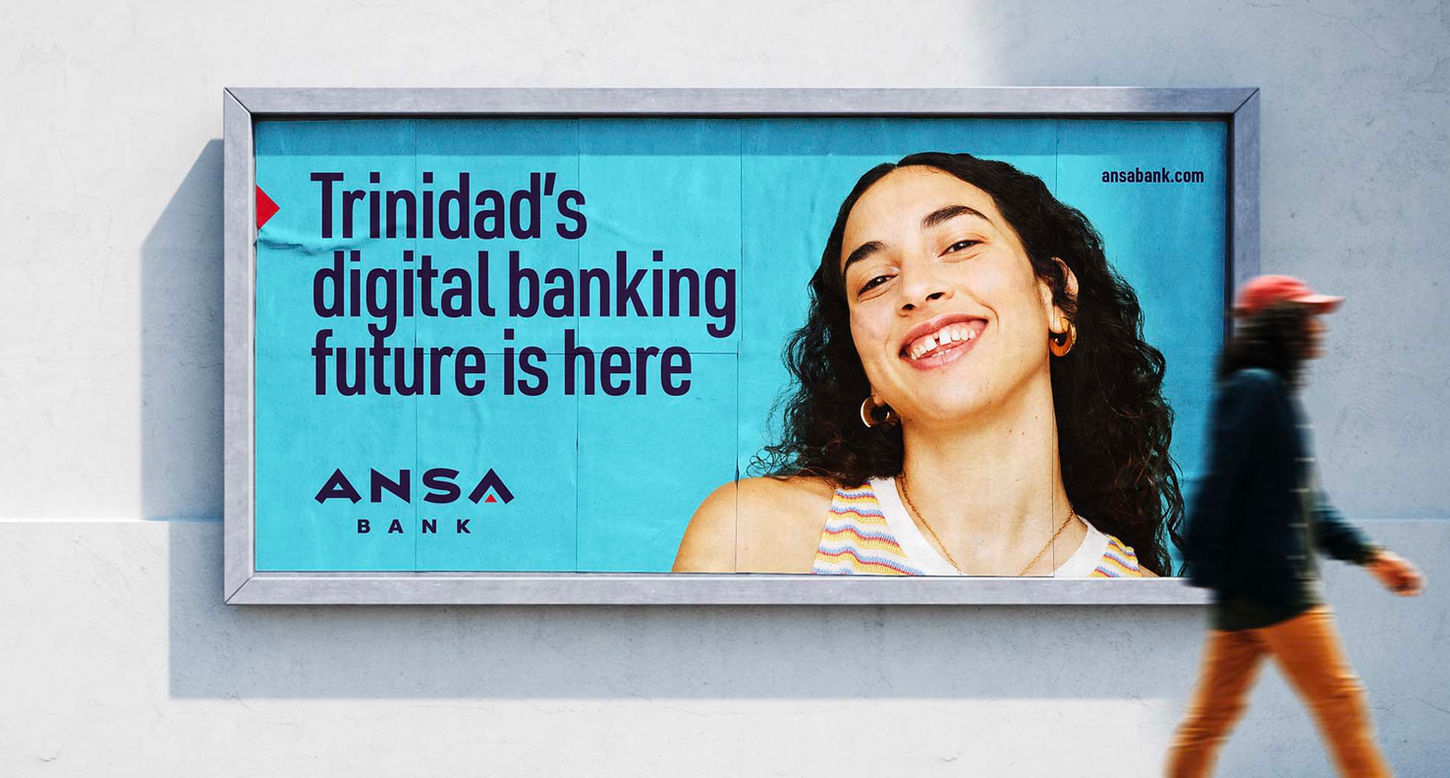
For some reason, digital banking has taken its time in arriving on the Islands of Trinidad and Tobago. It is true that some banks on the Islands offer a weak form of digital banking, but all are a hybrid form of digital added to an existing analogue offer, where queuing and endless form-filling are still the norm. ANSA Bank has changed all that in one fell swoop.
Before we even started, we spent time with the individual members of the Bank’s Board, pinpointing what the eventual new bank would be and what not. We then presented the chosen final concept to the bank’s owners. Having gained their approval, we then began building the new bank literally from the ground up.
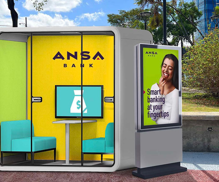
The main thrust of ANSA Bank’s introduction of a fully digital banking service is its App. The ANSA Bank App has been designed to work as a stand-alone banking service. Over the next few years, the bank’s branches will have an important supporting role, as being a place where those who are not digitally savvy can be guided on how to comfortably manage their banking services through their mobile phones or computers. Slowly, they too will need the branches less and less.
The ANSA Bank card is the second most important element in this ANSA Bank offer. It is not a Credit Card, which wrongly gives the holder the feeling to easily overspend, but a Debit Card, which is simply a digital key to the personal bank account of any bank customer. The Debit Card allows customers to pay for all their daily needs without the necessity of carrying cash.
Together with the ANSA Bank’s advertising team, we created a platform which would be the springboard for all initiatives of this pioneering bank. Unthink Banking became the anthem for this new mentality. The visual language for this new bank avoided any connection with what all banks are using. Our reference, if any, was fast-moving consumer goods and even sports brands.
We at Brandology developed the central conceptual proposition of this new bank. Helped create all the visual and textual assets needed to build nearly all of its necessary touchpoints. Including its physical branches, all brand carriers and all messaging used in communications, whether informative or to attract customers, new or old. The overall result fearlessly breaks with tradition, cementing the bank’s stated ambition to be THE PIONEERING DIGITAL-FIRST BANK of the region.


